TL;DR
- 2026 recruitment website design is about doing fewer things better, not adding more.
- Lightweight layouts, strong contrast, and clear structure outperform over-designed pages.
- Incremental improvements that boost speed, trust, and usability beat chasing trends.
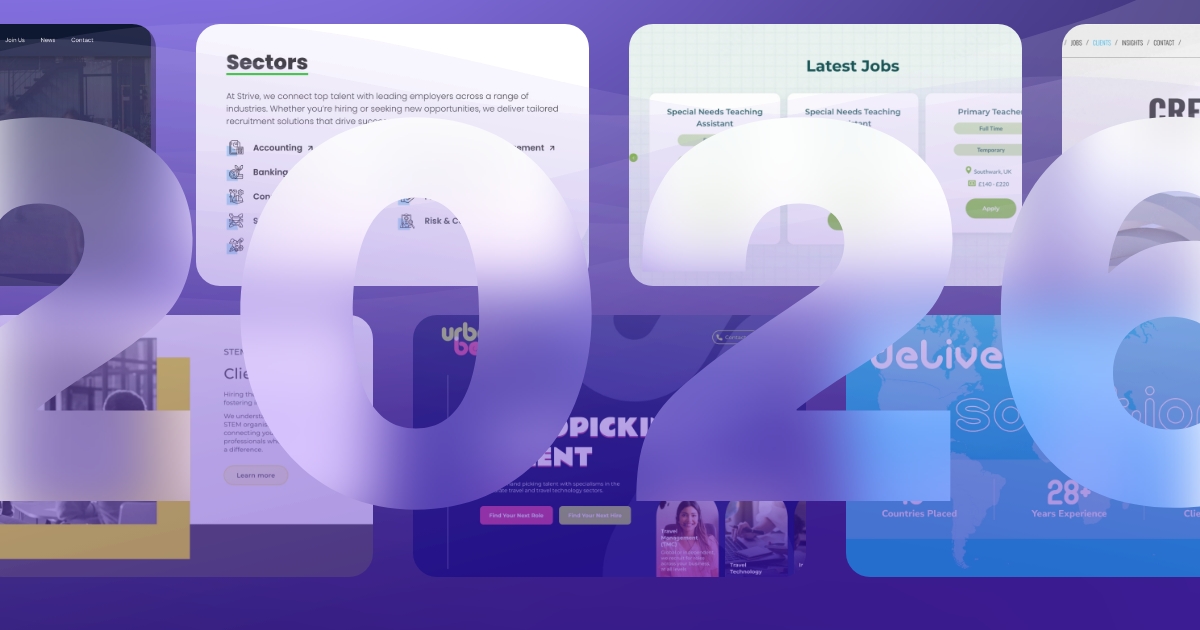
Recruitment website design has been quietly maturing.
Over the past few years, we have moved away from overly busy layouts, stock-heavy visuals, and sites that try to do too much at once. In their place, we are seeing calmer interfaces, clearer journeys, and design decisions that feel intentional rather than decorative.
As we look ahead to 2026, that evolution continues. The focus is less on dramatic reinvention and more on refinement: making recruitment websites feel more human, more confident, and easier to use without sacrificing performance.
Here are the key recruitment website design trends shaping 2026, based on what we are seeing across live projects and how our design team expects things to develop.
Relaxed Grids And Imperfect Precision
Perfect alignment is no longer the goal.
In 2026, recruitment websites are embracing relaxed grids. Layouts still follow a structured grid system, but designers intentionally break it in small, controlled ways. Sections overlap slightly. Content shifts off-centre. Elements feel placed rather than snapped into position.
This approach creates flow and personality without compromising clarity. It feels more natural and less corporate, which is especially important for recruitment brands trying to appear approachable and human.
For recruitment websites, relaxed grids work particularly well on:
- Homepage hero sections
- Employer branding and “about” pages
- Campaign landing pages
The key is restraint. The grid is still there. It is just not shouting about it.
Soft Frosted Interfaces And Glass Effects
Soft, frosted UI elements are not going anywhere in 2026.
Often described as glassmorphism or frosted panels, this trend uses gentle transparency, subtle blur, smooth gradients, and soft shadows to create layers without visual noise. When done well, it adds a sense of depth and tactility while keeping layouts clean and modern.
For recruitment websites, frosted elements are most effective when used sparingly:
- Highlighting key calls to action
- Separating job search tools from background content
- Framing forms, filters, or navigation areas
The goal is not to feel futuristic for the sake of it, but to soften interfaces and guide attention naturally.
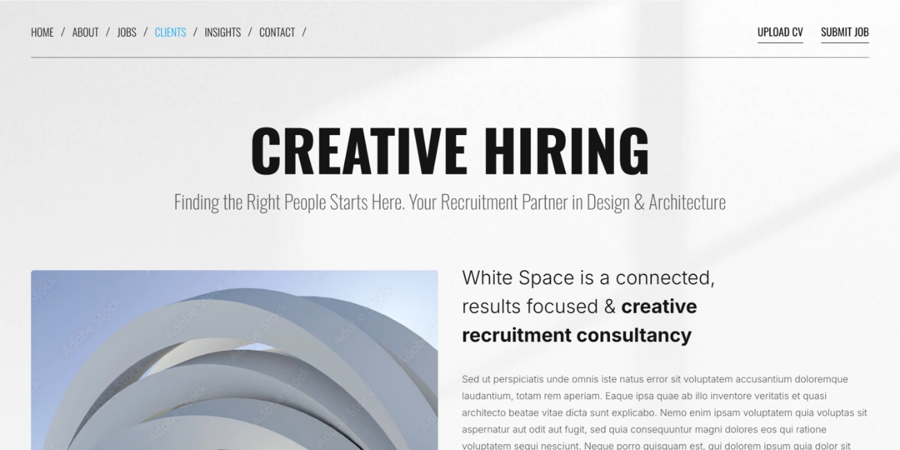
Typography As The Main Design Feature
Typography continues to take centre stage in 2026.
Oversized type has been around for a while, but the shift now is toward confidence and restraint. Large, clean fonts paired with solid colours or very subtle gradients allow text to do the heavy lifting without relying on imagery.
This works particularly well for recruitment brands that want to:
- Clearly communicate what they specialise in
- Lead with messaging rather than visuals
- Stand out without looking flashy
Subtle typography animations and micro-interactions are becoming more common too. Small hover states, gentle movement on scroll, or slight weight changes can bring text to life without overwhelming the page.
When typography is treated as a core design element rather than an afterthought, recruitment websites feel sharper, more intentional, and easier to scan.
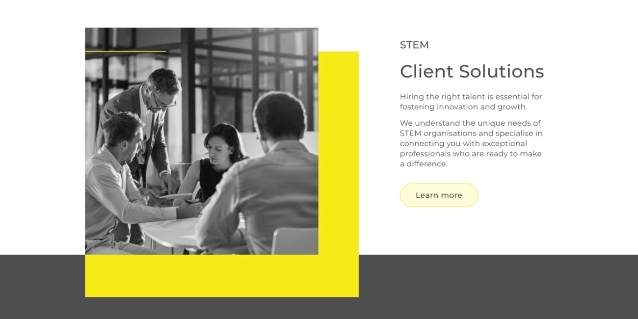
Subtle Textures And Materiality
Digital design is becoming more tactile.
In 2026, we are seeing more recruitment websites introduce very subtle textures to add warmth and depth. Think soft paper grain, gentle fabric-like finishes, or light diffusion effects that mimic natural light.
These textures are never loud. In many cases, users will not consciously notice them, but they contribute to an overall sense of quality and realism.
Used well, subtle textures:
- Make flat layouts feel less sterile
- Add character without visual clutter
- Support brand personality without overpowering content
This trend pairs naturally with calm colour palettes and minimal layouts, helping recruitment websites feel more human and less transactional.
Expressive But Purposeful Micro-Interactions
Micro-interactions are becoming quieter, smarter, and more intentional.
Rather than flashy animations, 2026 is about expressive micro-interactions that serve a purpose. Small movements help guide users, confirm actions, and improve understanding without drawing attention away from the task at hand.
Examples include:
- Subtle text shifts on hover
- Soft ripples or fades to confirm clicks
- Gentle motion as content enters the viewport
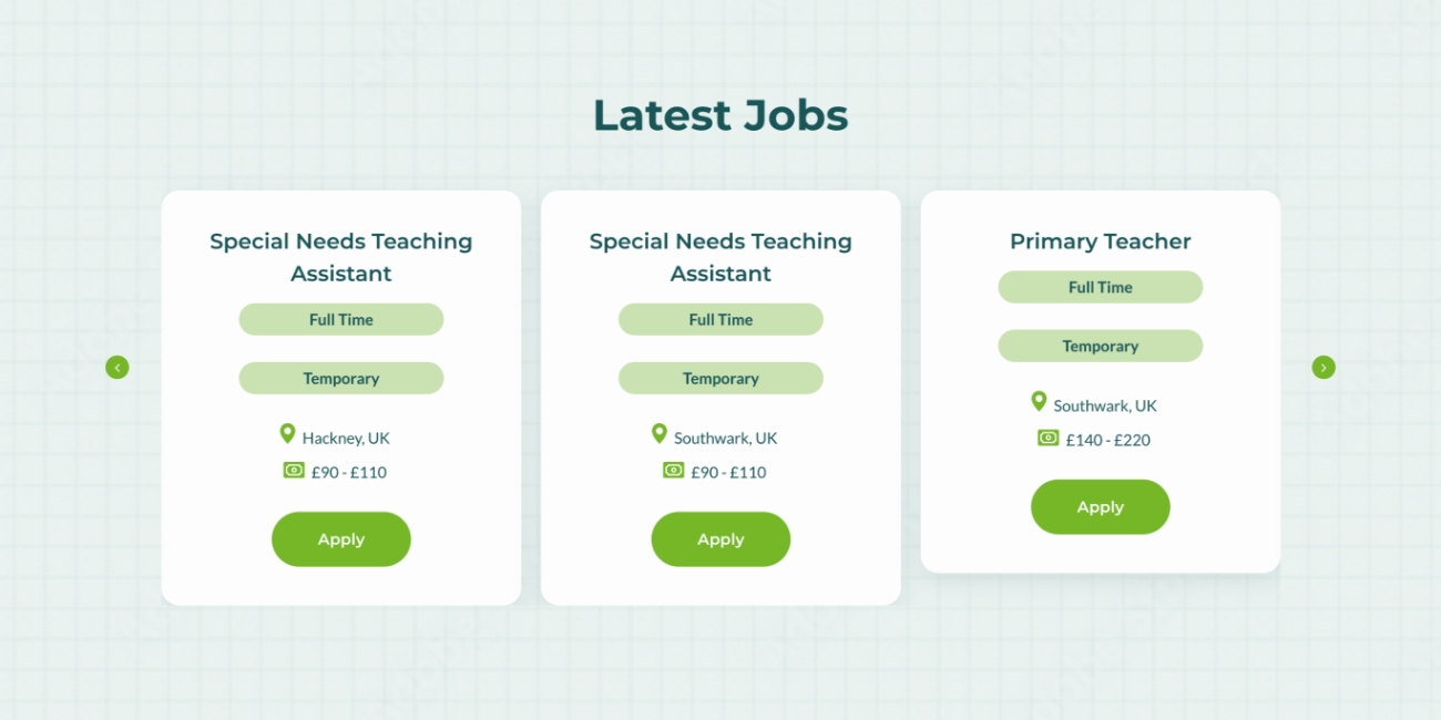
For recruitment websites, these interactions can improve usability across job search, application flows, and CV upload journeys. When used correctly, they reduce friction and make the experience feel more polished without slowing users down.
Performant Minimalism And Lightweight Design
Minimalism in 2026 is not just about aesthetics. It is about performance.
Recruitment websites are increasingly being designed with lightweight, SVG-first graphics, carefully chosen type systems, and fewer heavy assets. This results in faster load times, smoother interactions, and better performance across devices.
This approach delivers real benefits:
- Reduced cognitive load for candidates
- Faster access to job listings
- Improved mobile performance
- Stronger foundations for SEO and accessibility
Minimalism here is functional. Every element earns its place.
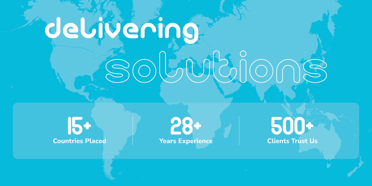
Personalisation And The Return Of Bold Counter-Trends
While many brands will continue leaning into softness and calm design, 2026 will also see a clear counter-trend.
Some recruitment websites will move in the opposite direction, embracing bold colour, high contrast typography, and expressive layouts. Influences like Pantone’s 2026 palette are already pushing designers to experiment with stronger visual identities again.
This is where brand clarity becomes critical.
Both approaches work. Soft, understated design can feel premium and calm. Bold, high-contrast design can feel energetic and confident. The right choice depends entirely on:
- The recruitment brand’s personality
- The audience being targeted
- The roles and sectors being recruited for
The strongest recruitment websites in 2026 will not chase trends blindly. They will use them selectively to reinforce who they are.
What This Means For Recruitment Websites In 2026
Design trends for 2026 are less about dramatic shifts and more about maturity.
Recruitment websites are becoming more human, more confident, more intentional and more performance-focused.
The most successful sites will balance visual expression with usability, clarity, and speed. They will feel calm without being bland, bold without being chaotic, and modern without sacrificing purpose.
Ultimately, good recruitment website design in 2026 is not about following trends. It is about using them thoughtfully to create better experiences for candidates and clearer outcomes for recruiters.

Design and build high performing recruitment websites
Showcase your brand at its very best with a tailored recruitment website designed with a wealth of recruitment features and functionalities.


